Icon Picker
Context
In content authoring, the hardest balance is giving editors enough freedom to be effective without letting them run wild and break design consistency. Governed flexibility is the sweet spot: editors can make meaningful choices, like selecting an icon, background color, or layout option, from a curated, predefined set.
The provided code is intended as a guideline and must be tailored to suit your specific implementation requirements. Please ensure thorough end-to-end testing is conducted to validate its functionality and performance in your environment.
Execution
Sitecore Marketplace allows you to extend your fields and creating a model when the user locates a custom field that has been created.
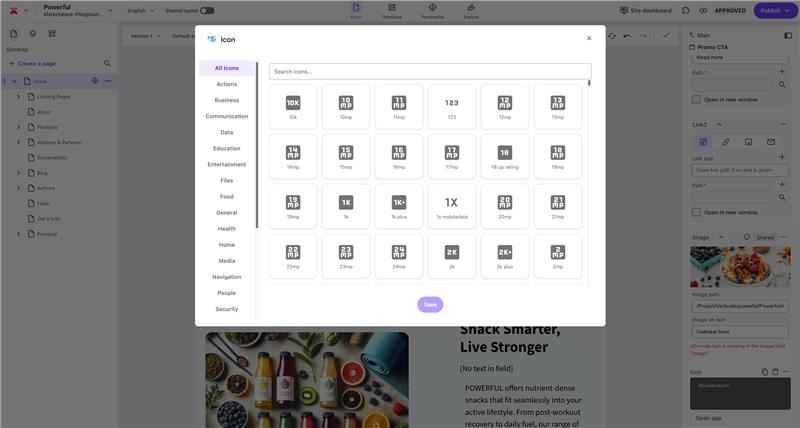
The Marketplace Icon Picker is a sample app that allows edtors to select their preferred icons. Instead of forcing editors to memorize icon names or depend on developers to hardcode them, the Icon Picker opens a curated library of Material Design icons in a modal. Editors browse visually, choose the icon that fits their use case, and the field saves a clean string value into XM Cloud. On the rendering side, that value maps directly to a Material UI icon component in the head app.
This flow embodies governed flexibility:
- Freedom for editors who can select from hundreds of icons to match context—call-to-action buttons, feature highlights, navigation cues—without waiting on developers.
- Control for developers/designers with an icon set is bounded, consistent, and tied to a UI library already aligned with the design system. There’s no risk of rogue SVG uploads or one-off styling.
You can find the code to setup, or extend on GitHub - Marketplace Icon Picker.
Insights
What emerges from the Icon Picker use cases is a clear shift in how editors interact with design assets. The real value is how this allows changes in workflow, governance, and experience.
- Editors no longer rely on developers to anticipate every variant of a button, feature block, or navigation link. They can tailor visuals to the situation at hand, which raises the quality of the user experience without bloating component libraries.
- By drawing from a predefined icon library, the system protects brand integrity while still feeling flexible to editors. It’s a subtle but important guardrail: choice exists, but only within safe boundaries.
- Every time an editor makes a small change—like swapping an icon in a navigation menu—without logging a ticket, the organization saves both time and cost. Over hundreds of edits, this compounds into a significant efficiency gain.
- The live preview in the modal shifts the authoring experience from “guess and check” to immediate clarity. That kind of feedback loop builds trust in the system and lowers the barrier for less technical contributors.
- With the Icon Picker available as a packaged app through Marketplace, teams don’t reinvent the wheel. They inherit a governed model of flexibility that plugs into Page Builder, allowing them to focus on higher-value extensions instead of solving the basics.
Related Documentation
- For recipe suggestions, questions or feedback, please use the form.
- For direct contribution, please create a pull request on the Github repository for review.